Friday, 14 December 2012

Tigerprint Christmas Competition!

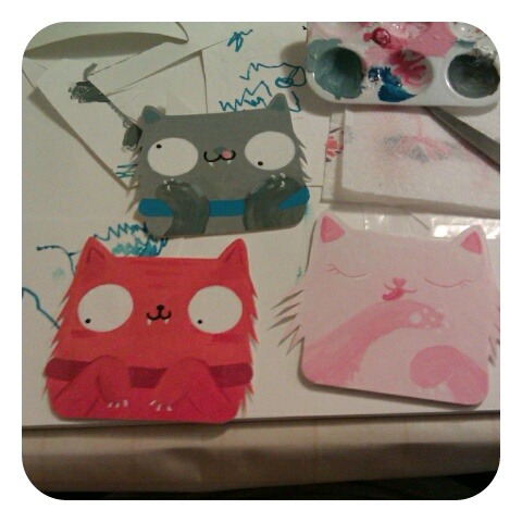
Below is my entry for the latest competition at Tigerprint (http://tigerprint.typepad.com/competition/). I've been slowly planning it for what seems like ages now and today I finally got round to doing the final thing. After assessment feedback I came to the conclusion I needed to change the way I work a little, so I decided to draw straight into Photoshop with my tablet instead of making the shapes in illustrator first and I used brushes that would give it more of a texture. I also took advice and used a free colour theme website thing to help with choosing colours so I don't go mad with them like I usually do. I am rather happy with the result! I can now draw cats a whole lot better than humans though, which annoys me a bit. I'll just have to make everyone into cats in future. I hope the world likes cats... o_o


Happy Christmas Everyone!

Wednesday, 28 November 2012

FMP Moodboard!


Monday, 19 November 2012

How to Write A Book In 30 Days (2)

Edited this slightly. The feedback I got was to add more of a ghostly/time passing theme to it as I'd done the hands a bit ghosty... So I changed the background from pens to clocks.

Saturday, 17 November 2012

Social Gathering Edit


Ok, so it's still pretty horrific, but I've attempted to revisit this project a bit before hand in...

Friday, 9 November 2012

Story book Ideas

My three main ideas for the kids book.

Thinking graveyard one or animals one for final piece. 
Finding it difficult to really get into this project. 


Sunday, 28 October 2012

Final Pocky!

I think I am just about finished now. I might make a few adjustments after feedback but for now this is my final piece. 

Line or no line?


Black line around characters...or no black line around characters...? Hmmm....

Working on text today. Going to use this existing font but edit it slightly in Illustrator and add stitches, hopefully...

Friday, 26 October 2012

Pocky in Progress


This is my Pocky final piece. It is about 90% finished. I completed the characters and background today and quickly added text just to see how it would look. Over the weekend I need to add stitches to the text and generally play around with the placement of text and font til it's right. I also feel it needs something in the background. 

Thursday, 25 October 2012

Las Vegas

Final editorial for Madness of Crowds ed. 
Don't really think it's that great for the intended audience but I'm not that unhappy with it. This was the most challenging editorial so far. I struggle trying to make 'grown up' images! D: But I'm enjoying being able to do quick little digital pieces because it's making me better with Illustrator/Photoshop and when we do big pieces I panic and run to paints usually because I'm scared of not being able to do it in time digitally, because I tend to experiment more when I do it that way, taking up more time. 
I also used a tutorial to learn how to draw stacks of poker chips! :D Which may come in handy some other time.

Wednesday, 24 October 2012

Wine Label Competition

I tried to squeeze this project in because it seemed quite fun to do and I thought, why not give it a go! So this is my entry for a Christmas themed, humorous wine label competition from Gifts4U. Got to email it by 31st of October so I might have time to tweak it by then but with the Pocky project deadline coming up and dissertation changes to do I probably won't. But anyway, here is my entry.


Friday, 19 October 2012

Pocky work so far...

Sketchy sketches.


Rough, ROUGH, colour experiments...


Again, just a rough idea of the type of colours I'm looking to use.

Perhaps the final plan?
I'm not happy with the 'FOR'. And I want to do my own version of the font, to make it a bit chunkier. Still not sure whether to do it all digital or paint the characters. The problem is getting the paint to look good through the scanner... It usually looses it's niceness at the part of the process...

Thursday, 18 October 2012

Sun, Sea, Sand...and Sniffles


Latest editorial work. Wanted to get it done today so I have the entire weekend for the monster project. Not 100% happy with it but I don't want to spend any more time on it just yet. Maybe a little after Monday's feedback.

Friday, 12 October 2012

Editorial Work


This is my final outcome for the new editorial brief. I am quite happy with it apart from the hands. When I draw the hands with pencil in my sketchbook they look good and then when I go over it in Illustrator, they go a bit...static. If that's the right way to describe it. Anyway, I'll leave it for now and come back to it later, if it's really bugging me. I also must remember to print it using uni computers because it looks awful on my home printer, which is running short on ink! That worries me because I'm planning to print off my dissertation  tonight and it's going on for 20 pages, if not more! Also need to get on with Pocky project. I am a little more behind then I'd like thanks to Thursday's train fiasco. Got up at half 5, to come in early and have a super productive day. Got to the station at 7.22, the train did not arrive. They then added on 1 minute to the expected arrival time, each minute it didn't arrive... for 30 minutes! Then they announced that the train after it was late, but no announcement for my train! The man at the other end of the 'help line' said it would be another 10-15 minutes. It was then announced that the train was cancelled. Then I got a headache because I was panicking, like I do, which then stopped me from doing much work at all. Anyway, rant about East Midlands Trains over, back to Pocky and dissertation. 
Friday, 5 October 2012

Character Project, Tried Again

Redone the character piece after loathing the original one. Not sure what to think of this any more either! XD
Oh dear. 
It needs something in the top left corner, I think. I'd like to collage a clock there but I'm not sure where to get a picture of a clock from that I can use. Hmm...

How to Decorate.

I would like to use the pavlova image in the final but I'm still playing around with composition. I quite like the close up of the dessert now, better than with a bowl, which was the original idea.


Pavlova

After some experimenting, I'm liking this kind of style. I don't know whether the pavlova isn't ridiculous enough. Also unsure what to do for a background. 

Characters in a Social Situation


This is my final piece for the characters project. I knew from the start it would probably not go too well with having so many elements in one picture and sure enough it's not gone too well... I was happyish with the final idea and wanted to do it digitally. But as I'm still fairly new with the whole digital thing, I didn't have time to get it done that way (and wasted half a day trying, in the process along with a few hours having a mental breakdown). I then turned to acrylics and it is pretty rushed because I have the editorial looming over me and all these competitions which I'm already worrying about, time wise. I don't think I made a definite decision on whether I was keeping all the characters in their original style or making them all the same. I also struggled with colours. This has not made me feel very good about the rest of the year! Maybe it's because it's the first project after coming back. The last few projects of second year went really well and now I feel like I've gone right back to square one.

So yea, I'll probably be wanting to re-do this one.

Today I'll be attempting to get on with the editorial for Monday. It involves giant trifles.

Friday, 28 September 2012

Some self portraits

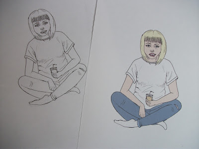
Some little self portraits. This is how I seem to be drawing people at the moment.

Character Project


This is my final idea for the character project. I'm not entirely sure what led me to a diner idea but I think it's because I wanted a burger at the time I was trying to think of ideas. 

I like the general layout of the characters but I'm not entirely sure how I'm going to make the image. Thinking of doing ALL the characters digitally, as well as the background, as only two of the characters weren't digital in the first place which will mean two of them would just look really odd... Not sure if that's cheating or not. 

Monday, 10 September 2012

Friday, 24 August 2012

Princess

Ok, so I can't scan very well, but this is my last character.
Based on Mary Blair's work for Disney. Of course it had to be a princess. I think I've also been somehow influenced by Brave because I noticed afterwards she has ginger hair and a similar colour dress to Merida in that film...

Friday, 17 August 2012

Character Again

In the style of Mike Mitchell.
Really enjoyed this one. Illustrator is becoming my friend...

Character Number...I've lost count


I love Charles Burns' Black Hole graphic novel. So I decided to create my own 'mutated' teenager. She has  grown gills and some scales. By doing this piece of work I discovered I don't like dip pen. 


Wednesday, 8 August 2012

Character 4.


This one is based on Daniel Clowe's style (more towards Ghost World characters). Originally wanted to have a devil girl type character but it turned into a teenager at a party, which I guess is more 'Ghost Worldy'.

Sunday, 29 July 2012

Character Project - Pirate

This is my second finished character. Acrylic paint.
In the style of...
http://www.flickr.com/photos/jackteagle/sets/72157616709439944/

Saturday

Managed another page in my gigantic sketchbook. 
Saturday's are my day off calorie counting. I take full advantage of this. 

Thursday, 26 July 2012

Commute


I was trying to do uni work the other day but it wasn't working, so I did this instead. I haven't drawn a comic for a while and I think I should more often because I enjoy it. My dream is to one day own a long arm stapler so that I can make little comic books and staple the pages together with ease.

Monday, 23 July 2012

Character Project 1

After struggling to get motivated, I have finally got some work done other than dissertation work.
This is the first final for the character project. Unless I come back to it before the term starts and fiddle with it... Anyway, it's in the style of Pendleton Ward. More specifically , Pendleton Ward's Adventure Time. She is a crazy cat lady, or possibly me in a few years time.

Other artists I've chosen are Charles Burns, Ben Templesmith, Daniel Clowes, Pete Fowler, Jack Teagle, J Otto Seibold. Unless I change my mind half way through, which is likely.
I'm not even sure I'll stick with this... but it's what I've been up to recently after a week of hardcore dissertation writing. D:

Tuesday, 10 July 2012

Editorial Summer Project

These are final ideas-ish, for the summer project to do with editorial illustration. 
My plan is to do dissertation work and character project work, then come back to these with a fresh pair of eyes.

Thursday, 28 June 2012

Shiver of Sharks!


Illustration based on the phrase 'A Shiver of Sharks'.

This is for a project that fellow coursemates are putting together. I think the plan is to make a book with everyone's illustrations in it at some point!

I don't know how these sharks have managed to start a fire underwater to toast their humans, but they must be pretty clever...

Thursday, 21 June 2012

Shiver Of Sharks - Progress


So far I've managed to do this today. The little sharky ice cave.

I will add the sharks and stuff in the next few days.


Monday, 18 June 2012

Competition

I'm running a giveaway type thing over the next 7 days. From 18th June you can follow me on Tumblr, Like and Reblog the giveaway post to be in with a chance of winning a set of postcards.


Saturday, 16 June 2012

Plan for Shiver of Sharks Piece

Completely changed my mind from the original idea. Going to do a more fun approach. I think it's more 'me'...

Friday, 8 June 2012

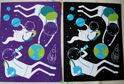
A Day Out In Space - Postcards


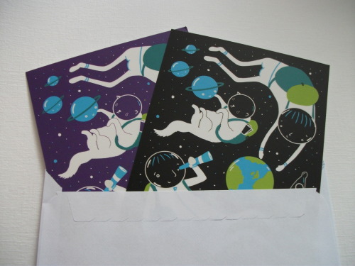
As I mentioned a while ago, I've had some postcards printed!
If you fancy having some, they are 50p each and available at sarahcrosby.bigcartel.com/

I hope you like!